How To Choose The Best White Paint For your design project

White has many personalities. It can be tranquil, dramatic, fresh, modern, bright, minimalist or maximalist, traditional, shabby chic and more. There are many shades and nuances, which can all be perceived in different ways in different settings. White paint has the luxury of transforming a space: a fresh coat of white paint is the easiest way to reinvigorate a room, whereas a crisp white can be the perfect backdrop for a stripped-back and elegant look.
With so many white paint colours and possibilities, it can be hard to pick the right shade but it's worth spending some time to select the right one for the effect you're trying to achieve.
The key consideration when choosing the perfect white paint for any setting or surface should be the amount of natural light.
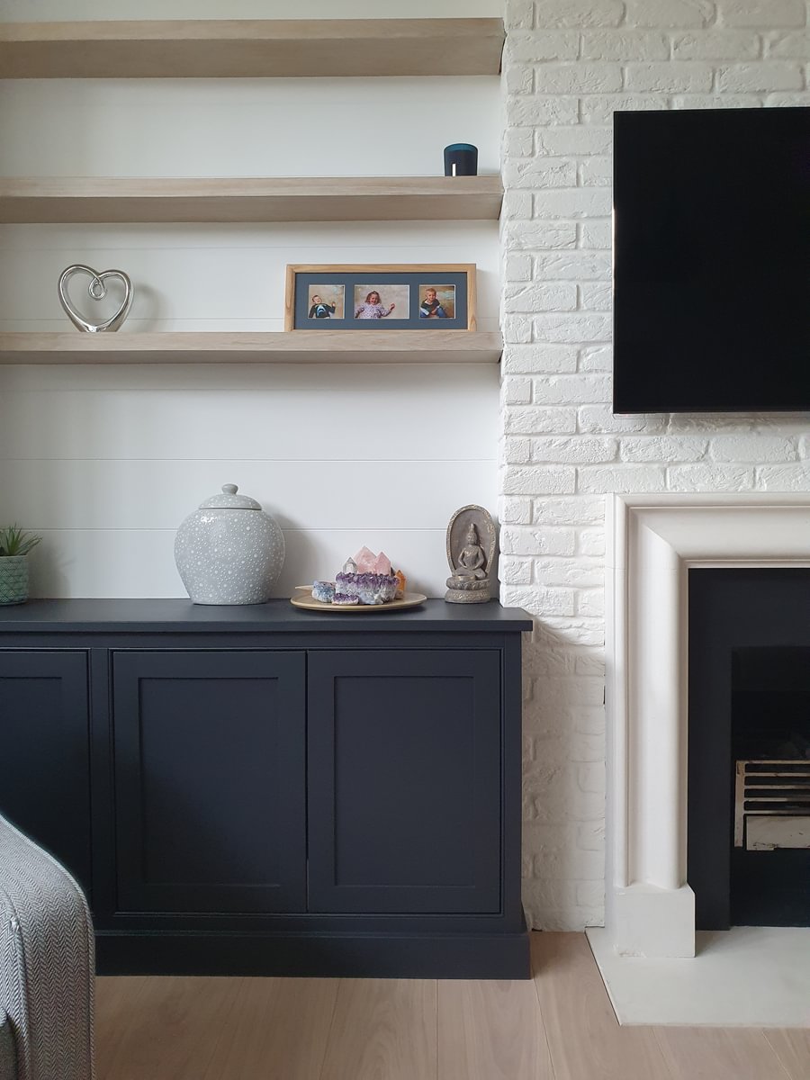
For a modern all-white colour scheme, it is important to find the shades that work together, whether it's complementing or balancing each other. For example, you may consider using different tones of white, starting with a bright, clean white on the ceiling to create height and a stronger shade to highlight architectural features. Using different finishes of the same paint can also bring a dimension to a room, for example, eggshell on walls and gloss on woodwork.
North Facing Rooms
The lighting of north-facing rooms should be the key consideration when choosing a white. Because they don't get as much natural light, choose a warm white that will compensate for it or balance the cold light. Artificial light can also alter how the colour appears and is perceived.
Dominic Myland, CEO at Mylands, advises avoiding cooler whites with green or blue undertones for north-facing rooms or those with poor natural light. They will make the room feel colder or even dull and colourless.
Instead, you should pick warm tones, like an off-white paint with yellow undertones such as Sloane Square™ No.92, St Martins No.37 or Lots Road No.24. On their own they can look slightly yellow, however, when paired with accent colours they transform into a warmer white which creates an organic and natural aesthetic.
For a fresh but warm off-white paint, the versatile pinky-white Holbein Chamber No.7 would be a good choice, as the warm undertones provide a subtle friendly blush to a room. Another great warm white is Honest John™ No.58
Walls in Honest John™ No.58
Walls in Holbein Chamber No.7
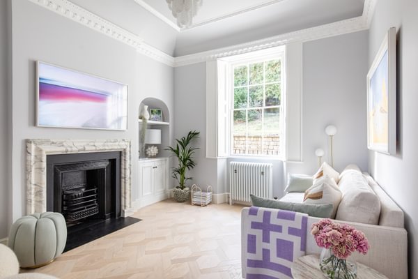
South Facing Rooms
Walls in Honest John™ No.58
Walls in Maugham White No.2
All-rounder white paint
For an elegant neutral look, you may want to consider Elgin™ N.20, which originates from Myland's archives and takes its inspiration from the Elgin Marbles. With its grey/blue/green undertones, this naturally pigmented paint is a true chameleon as the tones can appear pink or green depending on the level of natural light and the rest of your interior design scheme.
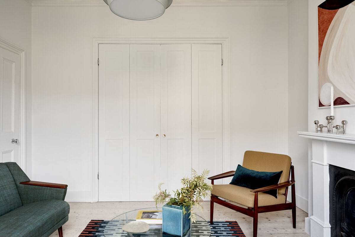
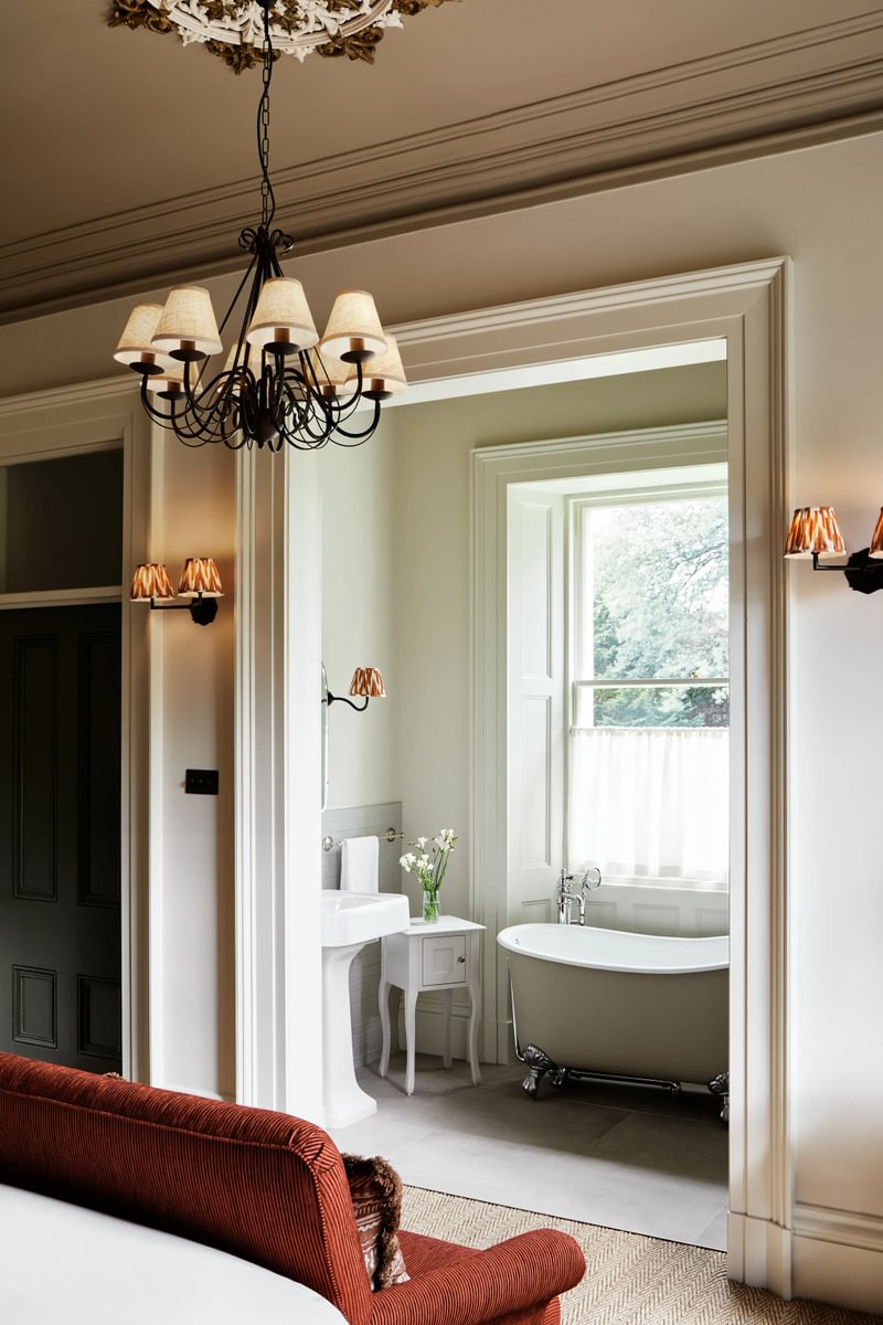
Maugham White No.2 white paint is versatile and can be used in any room, from living rooms, dining rooms, bedrooms and bathrooms or kitchens.
For a subtle look, choose a light yellowed off-white, such as our Holland Park No.5. This soft, warm-toned white paint is highly adaptable and brings a clean, sunny warmth to any surface. It is an equally perfect choice if you wanted to create a sophisticated white kitchen or a bathroom with a timeless look.
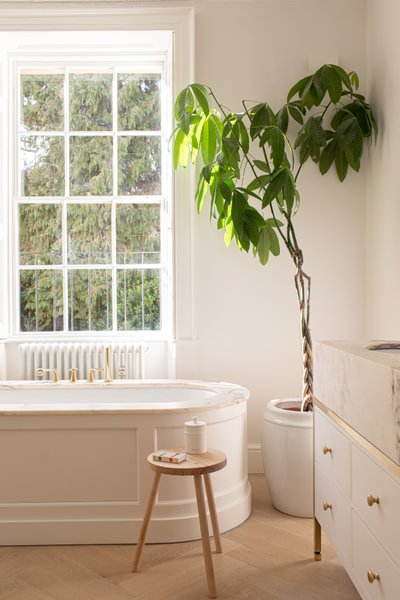
Walls in Holland Park No.5
Walls in Maugham White No.2
A Mylands special brilliant white
For a luminous and brilliant white, Pure White No.1 is our purest white paint. Blended with pure white pigment, China clay and crushed marble, this fresh and bright white pairs well with numerous shades in our collection.
For high traffic areas, pure white paint can also be considered. Available in our Marble Matt Emulsion, Pure White No.1 is a premium brand emulsion suitable for kitchens and bathrooms and has Class1 European scrub test resistance.
Containing crushed Carrara marble, Marble Matt Emulsion has magical qualities which come alive as daylight moves around the room and the reflection of light changes due to the natural marble mineral content in the paint.
Walls in Pure White No.1
Create a dramatic space to show off artwork
There is a reason that matt white walls are used as a backdrop in art galleries, and that is because flat white creates a blank canvas by absorbing light and highlighting the paintings on show. You can achieve the same effect at home by choosing a neutral white complementing it with soft pieces such as woodwork, fabrics or plants. Mylands has manufactured paints for film, television and theatre for over 80 years. This has helped us develop paints with an unparalleled density of pigment that is perfect for showcasing works of art in galleries. We have supplied the Frieze Artfair for many years with our PURE WHITE™ NO.1 emulsion which was selected due to its very high concentration of titanium dioxide white pigment creating a true white which really lets artwork shine. Not just to be used in galleries, our pure white paint can be used in your home to showcase your favourite painting.
Walls in Walpole No.42
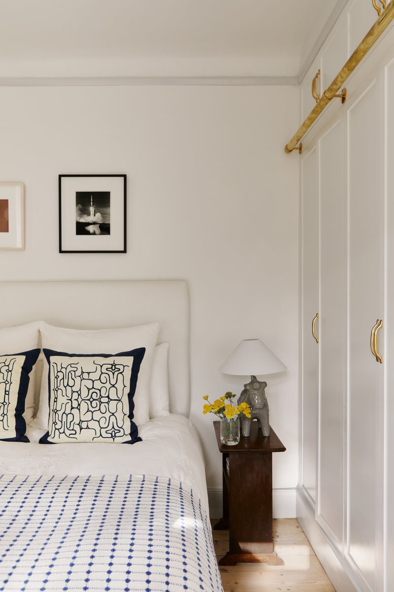
Bed Frames and ceiling in Maugham white No.2
How to sample test the different paint colours?
Because light has such an impact on how white paint colour will look and feel, always get tester pots and sample them on the actual surface you want to paint. It is always best to paint a large 1m2 sample, ideally on lining paper so you can move the paint swatch to different areas of the room and check how the colour presents itself at different times of day. Painting the tester onto a white background is better than testing on cardboard or other darker surfaces as some of the base colours may distort the top coat and not give you a true representation of the final finish. Whether you're looking for a white to be the centre of attention or the blank canvas to your colour scheme, have fun playing around with different ideas. Decide if you want warm or cool whites, then narrow your choices to a few options and finally test them out until you find the right combination. The right choice will feel right!

Floor in Whitehall No.9


